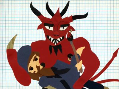
Adidas: AdiColor: RED by Roman Coppola & Andy Bruntel
 http://www.r213g037b053.net/
A brief history of the color red, handmade with love by directors bureau operatives. Featuring playful paper cut-outs by Cayce Cole.
extremely well crafted and unique. i appreciate the creativity and coming up with a fun concept for the color red. this is a stand-out piece, and a great companion to Charlie White's Pink. the other ones are just not up to the level of these two pieces, not even close.
what?! this isn't funny, nor is it in any way visually interesting. i'm pretty accomodating, but this one's a stinker.
always a surprise how two talents teamed-up can produce a dud like this...
that was great! P's a pooper
really loving andy bruntel's work.
I love it! A great combination of creativity and mix of subtle and bold humor. I loved Charlie's but I think this may be my favorite thus far.
"This game is hard."
HA!
Charlie's the favorite, altho this'll go second and psy ops a decent third. But what I'm really looking forward to is Neill Blomkamp's...
...southpark...'yawn'....thats it.
this one is hilarious and inventive and crafty. i love it. short & sweet. bravo!
does anybody has an advice how to watch a quicktime 7-file on mac os9? (cause there you have only quicktime 6) -here for example I got only the sound -not an image ...
definitely the best of the adicolor thus far. i love it! it is so cute and really sweet. the cut-outs are amazing too.
I was unaware that Southpark invented paper and animation. Alright, so the style is nothing new but I really love the ideas.
I want to ride on a deer banana.
I think its very South Park. Watch South Park the movie and look for the Devil in it.
um just because the picture above is of the devil doesn't mean its ripping off southpark. the devil is in it for maybe one full second.
I think it's more like the movie Legend. The devil's in that one too.
"fucking awesome!"
Yeah but look at the Devil in South Park and then look at this Devil. Then talk to me.
Yeah it's all lightly South Parkian (is that Terence and Philip saying "What an a-wad"?), humor is corny.. still funny!
The cutout style does recall South Park...I don't think it's just Mr. Satan. Still, it looks great.
The humor is more akin to Look Around You, though not as absurd or clever.
I did look at it. They're both red and have horns! Woah, you must be right.
...alright, this has become vacuous.
Best of the bunch??
This is nice or whatever...but White's piece blows doors on this.
RED RULES! Can't wait to see BLACK by Chow. PS If you watch RED backwards i hear you'll see GOD!
It's just nice to see that ideas and humor are still worth something in the world of wanky, vanity, viral ads. This one kicks the other ones in the ass. They're prettier, and probably more in line with the sexiness that Adidas is trying to push, but screw that. I'm still waiting for someone to run with what makes Adidas great: it's relationship to hip-hop. Maybe Saiman's film will fill in that gap.
actually i liked this very much.
Also, on www.boardsmag.com ...
It's not so much that it has taken the south park "look" that bothers me; it's that it's taken the south park "look" that's been around for ten years and passing it off as fresh now that naive work is all the rage. Still funny though. I like the graph paper. -j
Aside from the fact that I don't think it even looks like South Park ( OK so they used some construction paper ) you guys do realize that cutout animation is one of the oldest animation techniques, right? I highly doubt they were trying to pass that style off as "fresh" since it's been around for a century.
But this sort of opens a whole other debate. I often don't care to watch animation, especially in music videos, since most creators tend to use the same techniques and same software/filters/plugins it all sort of blends together stylistically even when presenting very different aesthetics. Has this "art" become to reliant on technology for visual innovation?
If anyone, I think Shynola is a good example of an animation team that keeping their work fresh, combining various styles and techniques. Aside from that there is some interesting stuff coming from the M.I.T. Aesthetics and Computation group.
I don't think it's so much a reliance on technology as it is a last resort. Animation doesn't typically eat up as many hard resources as film does. Say you get a budget for 5,000 to do a video. In a "real world" situation that leaves you fairly limited. In many cases just getting permits and insurance to shoot somewhere can run you 5,000. So instead of bothering with that hassle, artists are retreating to their computers where the only limits are time and creativity.
I agree, though, that people are letting the technology dictate their style, rather than vice-versa. But again that's typically a by-product of budget limitations.
