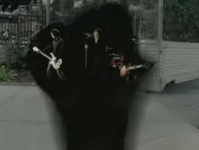
Snow Patrol "Hands Open", dir. Patrick Daughters

conceptual "breakthrough".
mp4 here.
(courtesy of the videoteque)
great video. the clips was kinda res. But looked like the graphics were a little low rent. But the concept was simple, somewhat fresh and added more dimension than just performance. I think daughters rocks more with performance vids like maps and gold lion. i have to check out more of his stuff. digging it...
Actually I think the concept on this is great. It probably looked excellent on paper and it still plays fairly well as a video. However I think it suffers from a few things, for one the "black void" effects look kind of weak. They look too much like computer imagery and they're all very flat and 2d. It would have been nice see the camera pan around them and play around with the prescence of the voids. In fact all of the shots seem kind of static and wide (probably because of the computer effects they had to do). It gives the video a very stiff feel. It would have been cool to be see the director and band have a little bit more fun with the idea. Although I thought the idea of bursting through the band's peformance footage at the end was a great way to finish the video. BTW was that a shout-out to Sufjan Stevens in the song?
yeah, ref to illinoise. funny.
Boys, this is a real stinker.
Idea: Lame and Stupid Photography: Nothing to speak of. Barely exposed correctly Effects: Amateur Direction: Stiff, hesitant, confused.
David Bowie gives this a LOW on his Spider scale.
conceptual "breakthrough"? not really this effect as been done before with the honda ad early this years. it very badly executed too.
this made me think more of a lame boy band than anything.
patrick daughter gets me up in the morning..sadly not today..
I think the concept's essentially good. It's a bit of a shame it felt so static.
But what really lets it down for me is the idea that upon ripping a hole in the fabric of reality you enter not an infinite void, but a small dark cupboard with Snow Patrol rocking out in it.
Actually, on second thoughts, perhaps that defines metaphysical angst. ;-)
A Deathcab pitch(rejected) I animated for Dickensian a while back featured a similar effect. I'm morbidly curious to hear if people think this is more or less effective.
NAJORK: The problem with yours is the composite. It's utterly the same effect, except that with PD's, we fall into black (a compositors favorite color).
The test seems really strange in its environment switch. I understand its simply a stab at the idea, but the changes in levels, contrast, and color feels a little jarring. Cool though, good work.
flv.
i need a link
c'mon mp4 plz
mp4 for slackers...
