Sony Bravia Ad (Dir. Johnathan Glazer)
The follow-up to last year's bouncy-ball <a href="videos.antville.org"_blank">ad.
Yes, technically not a music video, but it's probably of interest for most people here if for no other reason than it has Johnathan Glazer attached to it.
<a href="www.bravia-advert.com"_blank">MOV
Jeez that crap is all other the place. Please. It's not very good.
My initial reaction is one of being mildly underwhelmed. The use of 'The Thieving Magpie' by Rossini is yet another predictable Glazier 'homage' to Stanley Kubrick (the tune is used in A Clockwork Orange) and despite the competant coordination of the paint explosions to different instruments the overall spectacle has non of the charm, elegance or magical nature of last years Sony Bravia spot with the bouncing balls in SF. It just looks like it is what it is; lots of paint splattering everywhere with a rather grotty residual effect.
Where's the Photosonics footage Jonathon.....?
Dampened by the fact that I've already seen dozens of production photos, unfortunately. :(
I wonder if this is less effective because it looks man-made, whereas the bouncy balls seem part of their environment?
Kudos on the audacious effort!
you miserable bunch of goons. this is a splendid commercial and made even more brilliant because it's REAL. Great soundtrack, wonderfully edited, accomplished and brave in-camera special effects. BRAVIA!
Overall it's pretty good, once you get the balls out of your head. I do feel pretty sheepish being critical of something so massive. Deserves much more praise than criticism.
I was never that huge a fan of the balls piece, which seemed like a bigger deal to the people making it then the actual audience (I think I saw about 4 behind the scenes pieces before I saw the actual commercial), so it wasn't hard for me to forget about that while watching this spot, which I think was superior in almost every way. I have a hard time believeing that absolutely everything was done in-camera, but either way the pacing and the color itself was amazing.
The vibrant colours of Sony Bravia sure do look good on my computer monitor! Actually the piece has a good lo-fi, diy feel. But I agree with Spit, all of the PR bigging up of these spots is bordering on overselling them. The ads alone would actually be more impressive without all the surrounding making-of stuff...
what strikes me is how much of the paint isn't real, explodes wrong (failing the fireworks effect), and is pretty crappily lit/composited to boot. (sorry, zaki.)
only nice moment: the coloured rain at the end (what a much more powerful commercial that simple concept would have made).
definitely hurt by the hype - bad mistake to attempt to replicate the response to the bouncies by plan.
ps: to shortsville with ye!
@zakiii: its not all shot in camera, loads of cg-fountains etc...fx done by mpc, flowline for fluids...
I don't think I would take too much away from this spot just because it isn't completely in-camera (a uniquely antville prejudice), but I would be interested in knowing how much of this is the real deal. Either way, it looks really great, and the pacing and epic buid-up is enough to sell me on this being one of the most eye-popping ads of the year.
amazing! actually i thought it was computer fx, but it''s real
I agree with progosk, there are a couple of paint incidents that are pretty ropey. I think something of this magnitude and with a director of this standing is asking for people to be ultracritical, and its only a minute long so they should have managed to keep the quality up throughout. tut tut.
Yes, underwhelmed too, real or not (doesn't really matter to me - most things are manipulated these days) Without doubt a staggering production achievement, but where is the magic? Maybe it's the location which makes it all a bit drab. Had they shot on some magnificant palace, or a landmark of some sort it may have taken my breath away.
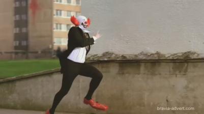
The best bit by far is the clown - pure Glazer. Oh and the end shot is pretty cool too - the way all the paint falls and changes through the spectrum.
The rest was just a case of getting through it - one explosion after another, seen one, you seen them all.
Nowhere near as good as balls.
THE MAKING OF:
Let's not forget - the Bouncing Balls spot 'cheated' by adding a selection of hero balls in post. The vast majority of the paint FX in this ad' are real - in the sense that they were shot live. What lends a considerable sense of artifice to to the tutored eye is that the means of delivery for the exploding paint have been erased. In the multitude of youtube clips that purported to be have been shot by casual observers (actually mostly agency bods) you can clearly see that the tower block is encrusted with plastic barrels - all of which are absent from the final footage. Similarly the air mortars which appear from knowhere at the peak of various fountains of paint have simply been tracked and erased so that only the payload is seen.
Anyway, the post work is invisible to 99.9% of the potential audience - as is the internet hype. My beef is simply that the whole spot screams of contrivance compared to bouncing balls. The formal composition, the synchronisation with the music and the absence of any human element - save for the unbelievably contrived Clown and the rather anti humanist spectacle of a children's playground being wrecked by a deluge of paint; imagery more suited to Threads or Terminator 2!
Glazer excels at creating a controlled aesthetic but, compared to his peers, seems unable to provide any real resonance.
I personally don't think it matters if there are effects or not. What matters is whether they get in the way of watching the ad. In this case, they don't.
I think it's ok. Yes, as a sequel to Bouncing Balls, which is one of the best commercials this decade, it can't really win.
I repeat my argument about the location - surely you shouldn't shoot something somewhere just because thats the only place you can shoot it. Isn't it more important to get the location right, rather than merely get it done? Imagine doing it on, for example, the Statue Of Liberty or the Eiffel Tower? Landmarks without colour. Sure there would have been a hell of a lot of post, but WOW that would have been something. Council estates are never cool.
all i want to know is who's cleaning up after....
I thought this was cool...kind of ineresting post 9/11, but despite the hatred, you can't deny the scale of it.
yeah i hope it wasnt shot in my borough - if council tax goes up this month im sending the bill to Sony.
glazer fo'eva!
i think the soundtrack was predictable. People love 'balls' because they LOVE the song.
Glazer has had some awesome music in his spots - maybe he's got a director cut somewhere.
i didn't like the cgi-looking stuff. would rather seen closeups of interiors than composites.
I think Balls had a winner of a song working in its favor, but once you'd seen the first 15 seconds, you'd basically seen the whole minute. A nice idea, but not quite the media event that its been publicized as. I think Glazer had a better idea, although I would agree that the location feels settled on.
Fucking wicked... I'm SICK with jealousy!!!! Big up Glazer!!!
at least it doesn't have jose gonzalez on it.
Tough crowd here. Had a hard time biting my tongue this time. The guy has consitantly had one of the most unique voices in features, music videos and commercials (the hardest format to make a mark your own). And again he does it. Beautiful work. Its about color vibrance and an unexpected spectacle just like the first Bravia ad. Remember thats what they want to create the piece to begin with; cause its an ad to sell TVs. This does it perfectly. In fact when I'm ready to invest in a flat screen I'll being looking at Bravias first. Perhaps its a drab looking location because it is a perfect blank canvas for color and a spectacle. Makes sense to me. If Sony can afford 6 days of clean up with a crew of 60 I think they couldve afforded any location they wanted. Amazing work from Glazer that once again rocked my world.
PS dont see how whether things were done in post or in camera has any weight on weather or not it was a great piece. And I know its just my opinion but BRILLIANT!!!
This should be on typolis.net ...
True, it should be on shortsville, but it wouldn't be getting a 25 comment discussion on shortsville. Also the last ad was posted on here so I figured this was fair game.
As for all the glorifying/villifying of Glazer, keep in mind that the idea was probably developed by Fallon, the ad agency. Glazer was probably more involved in the technical production aspects than the creative process.
Also I think cutcutcut nailed it when he says that they should be using a different location. The complex is an eyesore. With all the money they spent on this they certainly could have found/afforded a better location. It would be interesting to see this filmed in the most beautiful places possible; a city street in Rome, an ocean village in Greece. The landmarks thing is a great idea.
Having said that, I think what the filmmakers were trying to accomplish is give us a sense that this dirty, drab apartment complex is being brought to life by color. I think this theme gets undercut by the focus on all of the big pyrotechnics and paint fireworks. The best shots in this are the close-ups of the complex, the shots of green and yellow splashing over graffiti covered walls and washing over dusty rooms. The shot of paint raining down on the playground equipment is great. Unfortunately, the complex is so ugly that even after all of the paint it still looks dirty & dull. They could have done some cool effects in post to make it look vibrant & beautiful.
There is so much potential in this idea for a great commercial, the idea of an old abandoned dull setting being rejuvenated with color. They should have focused more on the details of the transformation and less on the paint bombardment. They could of had something poetic & symbolic. Instead they just have paint exploding in the air.
WHAT???
Sorry. But i have to say that i think the location is great. I'm happy that it's not the Statue Of Liberty or the Eiffel Tower!
"They could have done some cool effects in post to make it look vibrant & beautiful."
NO, NO, NO! - In every othe Ad you can see colorfull sky, green grass, ... everything is sooooo colorfull (because of post production) - I love the dirt location. And i also love that it looks still dirty with color in it. That is great.
otc: You got it: the piece lacks (some) subtlety. The music is a teeny bit too subtle for the paint/edit, the location is a teeny bit too mundane for the concept. Still, pretty good overall, imo.
quix: When thinking about that flatscreen, perhaps you should wait until they become more efficient?
Correction: LCD TVs, of which Bravia is one, are more energy efficient than tradtional CRTs. The article is referring to the less expensive plasma TVs. Spend away!
The idea for the "Balls" was stolen from Sandy Plotnikoff and Lucy Pullen, which realised their project Superballs in 1997. Link.
"stolen", pfffff. I think everyone of us has a idea like this in mind.
Maybe together we can collect a whole bunch of a obvious locations like the Statue of liberty, Mt Rushmore, Big Ben etc. .. totally miss the point and say we know better than Jonathan Glazer :) !!! Sorry had to point the obsurdity of some of these comments. I challenge anyone here to find a more beautiful ad on their tv currently running.
It is undoubtably a beautiful piece, but it is still flawed. Someone mentioned earlier the fact that we cast a more critical/descerning eye than the target audience of such an ad.
Whilst the general public wont deconstruct the processes involved in the making of the video, they are still aware and maybe put off, by an awareness of computer trickery, (even if its a subconcious reaction). In the balls ad I think many experts found it hard to notice the CG.
I personally felt that this had a lot of potential to maybe be really excellent, some superb shots, as it stands its just a good ad, certainly no classic, maybe time restrictions?
also off point a bit, it was way too close to orange's advertising campaigns
So you had the same idea before??? Since advertising industry feeds on stealing other peoples ideas, especially from art, it is hard to believe it is original. Look at the similarity!!!
Often ads and music videos take their cues from Art. Is that a bad thing? I mean Romanek wears his inspiration on his sleaves pretty loud. I think its all question of how its done. I tend to think I'd rather see ads made by people who are artistically informed than not. You all may remember VW cog..that comes straight from someone elses work but is a beautiful work nonetheless. Same is so I believe for an ad inspired by Theo Jansens life-like mechanical sculptures for either VW or Audi.
Its a simple fact that that advertising is taking over more and more of our space..hence I'd rather it be smart and art minded. If one has an issue with art and commerce ..take that one up with Warhol, he may have fucked it up for all of us.
Geez,why is everyone here so upset. this is a fantastic video. All of you are so caught up with this balls add. Somthing some of you seem to lack or you might not be here talking dirty with the other boys. But in all of your ball talk there has never been a mention about the origination of the balls.(okay I just notocied there was a link to this but it deserves to be here) in 1997 canadian artist Sandy Plotnikoff dropped 2500 balls of a building in Halifax. which the balls ad clearly borrowed from. And maybe we shouldn't forget before we say thing like "there is no human element" or "they cheated" This is a COMMERCIAL for a TV. A TV yes. just a tv.......... and also anything with clowns is okay with me.
WOW!! You could say I'm blown away! I think the shot right before the clown runs makes it look cgi. and the very last expolsion as well. they indoor shots were my favorite. i think it's wonderful.
my suggestion for the Eiffel Tower or Statue Of Liberty were of course obvious and predictable, but i was just highlighting a point that I thought a council estate was a little TOO subtle for me. I thought if you are going to go spectacular, you may aswell go all the way. This seems to be stuck half way between subtle and spectacular.
don't get me wrong. i do like this - i just think it holds back. for example - what about showing how beautiful the Estate has become now it is covered in colour?
I just read that Glazer is co credited as copywriter with the agency folks. That said sounds to me like he was more than just someone executing an idea. I think he rarely takes a job where he is to just shoot boards. There is apparently also a sound design only version with no music. I might have liked it more ..though Im not sure.
In terms of the location / spectacle factor I think that point is that they wanted to take a very mundane location that common people can relate to and then turn it into a grand color show. To me that makes more sense.
fucken great! love the clown terrorist... Am I the only one who went, "those balls look totally fake" in that bouncy ball commercial the first time they saw it? hehe, no, no they're real bouncy balls and thats why its so cool! ...oh. this was much better in my opinion, could be fake and still be great!
Bravia building destroyed!
Gives reason for why they'd let them shoot and do what they did here.
