Metric "Empty" dir. Jaron Albertin

Jaron's latest
mov (via promonews)
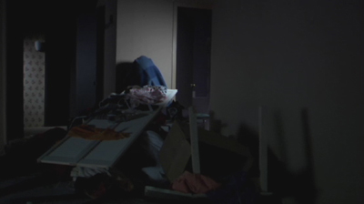
This video makes me smile. It's not like the whole reverse destruction thing hasn't been done before, but this one has some real eye-candy. Good edit also. One of my more favorite Albertin videos. Anyone know the budget?
My one complaint: the perspectives for the final house shot are off. That shot probably should have been cut.
albertin = infallible?
OH YEAH!
The performance looks like an after thought. So disjointed and way pretentious. Ok, it's really well shot and nice trickery of the objects (i was scratching my head on a few) but come on people, anyone with low/no budget can shoot this with a half decent DP. The footage needed to be faster, more erratic and not this slo mo beauty approach
good stuff. sort of like a reverse Justice vs Simian... I bet kanye would hate this.
the last composite shot didn't work for me. at all.
and wtf, this album came out in Sept. 05. A little slow w/ singles releases?
Antiville: ? anyone with low/no budget can shoot this with a half decent DP. Not really, we see examples of this kind of stuff not working every day. This works because of Jaron's technical prowess and his ability to create atmosphere. As for it being pretentious, it's no more pretentious than the next music video with abstract imagery.
nicely done.
the color contrast and composition of each shot is excellent. but it does take a while to get to the point.
ok, maybe pretentious is a little over the line overall. but i think you misunderstood me, its the way in which the performance is mixed with the abstract that bothers me more than anything. They're just disjointed cut-aways that dont lend themselves to the reversal footage. Which then appears as pretentious, or just a label insisted additive of the artist as she didnt appear in the video enough. Thats what i loved so much about about the 'justice vs simian' vid - no performance, and no need either.
But, i guess without the added performance we would have exactly that 'J vs S' in reverse
beautiful.
I think the performance footage is a nice "subplot" for the video, but to each his own. I really doubt it was demanded by the label. Just be careful about what slurs you throw at someone else's work. Especially since this site is usually the first thing that shows up when a director googles their name.
A little slow with the singles? My goodness we should already have a new Metric album. -Also Why haven’t any other solo Emily Haines videos been released? The first Emily/Albertin vid went so well.
(i really like the missing stops on this one.)
this video is fucking great
I'm not a huge fan of the video, but then again, I'll admit to having a minor preference for simple performance vids, so I wouldn't exactly refer to my taste as discriminating. I think it's executed very well--far better than Monster Hospital, at least--but I'm just not sold on the concept and its relation to the song; I realize there's a common theme of chaos/disorder, but I'd prefer something tied together a bit more concretely. I disliked the shots of Emily at first and was hoping for signature Empty move, but I now think what she chose/was directed to do works and seems less posed. Oh well. Maybe I can't enjoy it fully because I can't get over the unfortunate editing of the song.
As for its lateness, I'm 99% sure it's intended more for the UK, where Live It Out came a bit later (mid-2006 as opposed to late 2005) and they've been touring extensively. Their new album isn't due until spring 2008, but the re-release of GUABA is out in June.
Also on www.boardsmag.com (streaming QuickTime).
