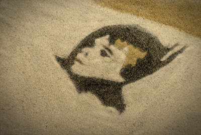
Low In The Sky, Cool Sanson, Dir. Tyler James
 This is my newest video, created by animating sand. FEEDBACK?
Absolutly wonderful. Mind blowing. Great job.
nice idea, and really well done. (somewhat embryonic, tho.)
So short, but really well done!
really nice - i only wish it was animated in ones or twos instead of 4 or whatever it is now. makes it stutter.
Great stuff. Shades of Caroline Leaf revamped for now. Very enjoyable to watch. The comment about animating on twos made me laugh out loud. Dingleberry could you please post a link to your seamless sand animation so that we can analyse it's flawless grasp of persistence of vision. Or would you prefer to be anonymously pedantic? I'm quite happy to enter into a discussion on the matter if you like.
a very touching story. I agree with dingle on the animation, it does jar. Don't want to fight though Ali.
However (and this is a guess) it's supposed to be animated by a child, so the niaevity works. But if that's the case, the style doesnt work, too graphic/stencilled.
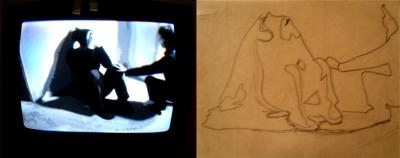
Obviously rotoscoped, was this done by projecting the footage onto the sand or was the sand manipulated over the footage on paper?
 to animate the sand, i took the original footage desaturated it and increased the contrast. i made a dvd of it, and traced every third frame with a dry-erase marker onto a piece of plastic. i took the outlines and painstakingly sprinkled sand onto the plastic. each frame took between 20 and 30 minutes to create. there were around 600 frames to animate, thats roughly 300 hours or 12.5 days. there was no rotoing involved
Antiville...Lets take this outside... The "jarring" effect you refer to is in my opinion part of the charm of the overall thing. I'm glad u picked upon the child thing...you really were starting to worry me...Moreover...ehhem...I'd rather be watching this piece of lovely animation on here NOW as opposed to say..in 2011. ;D I'm glad we all agree that it's great tho.
If anyone would like to see more lovely sand animation check out Rebecca Manleys "The Girl and The Horse" on Slink Pictures website. (This is infact animated on 1's and 2's) ... Enjoy..
"The Girl and the Horse" (2003) excerpt
really nice.
Thanks for posting your method tyler. Damn it!!!! i was going to say it's animated on 3's, would've made me look like a right pro, oh well.
Well roto you did sir, tracing the film onto plastic is exactly that. I understand the time consuming efforts of animators, i just hope you had enough time to eat, i've seen those guys nearly kill themselves for art's sake. Animators are truly a dedicated breed, we're not just talking edits here, every damn frame is painstakingly produced, i believe it trains their eyes to a level never understood by live-action film makers (well average ones anyway)
Girl and horse is lovely, saw that quite a while back, what's Rebecca doing now? haven't seen any new work since this one.
realy nice. I liked the stuttering effect. I though the compositions were well chosen and executed. The transitions between were quite nice.
Rebecca Manley is directing at Slinky. She also exhibits artwork. She did a nice piece for Square Art last time around. I don't think she's done any more sand animation tho. Sadly there's not that much call for it commercially. Takes too long. Especially on 1's! Sorry I'd better let that go now really hu!?
i'm a big fan of this, we just posted something on it over here as well
Ali T I was gonna argue with u til I realised u know your animation. Nice one. Love Aurora and Freak. Howz it done?
Aurora is done in after fx +Max...boring to go into really....
Sorry I really can't get my head round explaining software it makes my brain freeze up. Massive comp off...few photos whacked it....etc...
I'm really not planning on doing anything like it anymore. It's so intricate and posty I'd like to move on. I'm over all that wow factor 3d shit. That's why I like this sand stuff.
Freak was more fun. I just used PhotoBooth on my macbook. And then drew some shapes on it in After effects. For a laugh. I was waiting to hear back about a treatment and going a bit nuts.... I loved how simple it was to do in an afternoon..and I kinda like how it looks like anyone could do it on their mac. It's more about an energy I guess. I'm doing a liveaction vid now with geometric coloured shapes etc in a similar vein...Will keep u posted... Loving the sand tho.... And love love loving shooting liveaction! :D Was that u who just myspaced me?
i would have liked it to actually be MORE imperfect. it almost just looks like the best afterFX filter ever. if you could see a hand stick in even just on one frame or pull the cam back so you can see that its still in the sandbox, or maybe a bit of offness in the exposure. something more to go with the choppiness of the frame rate and make that feel more intentional.. like jan svankmeyer say, shits wobbling all over the place. just imo.
also 12 days to do a whole animated video is actually a pretty time-efficient animation technique compared to 3d.. so good on ya.
Ali. Who's ur DoP? Cant wait to see what you come up with. Agree about 3d etc. But still think what u did with it in Puleng was amazing. Cos it doesn't feel like straight 3d.. Nice 1. Oh shits I think I've hijaked this page and changed the subject.. Well it's all about animation I gues.
perfect!
Ben Moulden just Dop'd a job with me. He's ace.
It was a bit of a challenge as the client wanted the vid really lit..and I wanted it to have character.. Tricky. But Ben came up with some good solutions so I'm happy.
Yeah. I think we should have this chat elesewhere! As it's non SAND related!
Here's some cool animation links with regard to all of the above!
General animation cool stuff- www.a-i-r.info
Puleng- amazing mixed media animation www.lumeneclipse.com
More Sand- www.youtube.com
An interview with Tyler is posted HERE: siouxwire-annex.blogspot.com
