Midnight Juggernauts - 'Into the Galaxy' | (dir.) Rozan & Schmeltz

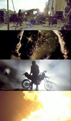
The set idea is nice (how much it cost?) But i was disappointed by the biker, too much a filler IMO.
Good fit for the song.
The Rolling Stones "Hot Rocks" album cover dissolve thing at the end was a nice touch.
Gorgeous landscape. Reminds me of the album cover for Dystopia (probably the inspiration, no?).

I don't know... There is nothing wrong with this video per say, but I can't help but expect more from Midnight Juggernauts. It's nicely shot, I like the locations and all that... but it's a bit flat. I've been listening to this song on repeat for months following Coachella and I can't help but think that sometimes things are better left to the imagination. I almost didn't watch this video because I knew it would be impossible to make anything that would do justice to this song.
I wish the video had more to do with a "galaxy" theme. I don't think it would have been too literal since their whole identity as a band represents that aesthetic.

I thought this was great. Nuanced, and exquisitely paced. The cinematography was superb with some inspired decisions.
I prefer the first version. Mirrors and fluorescents and a great song. What else do we need? The second version is beautiful, yes, but quite boring. Nice landscapes and fireworks but they doesn't seem to enjoy the song as in the first one.
thought they should have focused more on the end part with the fireworks and the nightime to tie it with the galaxy theme kee refered...the begining part just didn't feel like it fitted such an energetic song
uh... they did 2 versions? why?
Directed by Krozm for this one.
MJ released their Dystopia in Australia in late 2007 supported by local promotion incl. Krozm-directed clip. But after the Justice-Tour they had an international release with additional promotion. That means for the video-market: call partizan hassinator and do the re-shoot.
Me thinks, it's pretty dumb to do the re-shoot, but three are cool, Kanye.
excellent video for a killer band - we would love to work with them
Both videos are boring. The partizan one is expensive and boring, so it makes me angrier than the cheap performance video (which could have stood with a lot better editing, in my opinion). The band so reminds me of early Talking Heads, I want to see a lot more visual risk.
Also, was it just me or was the sound mix better on version 1?
this is good and unusual. Good to see MJ shot in a different environment and under natural light and out of their leather jackets and oversized tees for a change.
I think in 2 years time, once everyone has gotten over the whole galaxy/stars/nebulas/lazers/neon lights/disco smoke etc this can still live on for a while.
The only major problem is that it feels a lot like the 1st video with all the dolly work around the performance (which worked better with the 1st)
the 1st one was solid though
nice vid, but i think the original did its justice. they should've done more w/ the motorocycle narrative. the performance totally wanes and you can tell by nightfall the guys were cold and sick of playing their song.
my login name never felt so appropriate... enough dairy to fuel a space voyage here by the look of those plump cows...
live at pompeii meets the wraith is good in theory but for some reason doesn't quite work out here.
Looks beautiful, refreshed to see something on location on 35.
This has all the ingrediants to be epic including the song which is close to being a masterpiece - there are several good ideas but the edit and some of the random french provincial shots like the cheese platter picnic and some guys backslapping like they've found the newest hottest thing - i think they are in ther to make this large performance production look loose casual and humble but it comes off pompous...
Is that a cameo or a random the guy with the guitar case?
Thought the end was very pretty. Enough of a reward
Personnaly i liked it pretty much. It gives me this feeling of european films that ran in german tv in the early eighties, where every shot was a second too long and everything was kind of boring and not so over the top compared to hollywood stuff. I like the colorgrading and would also have loved to see more of the psychdelic fireworks in the end
This video is insanely good. Its the performance of Pink Floyd's Pompeii mixed with Evil Kinevil. Did anybody notice the similarity to the Stones Hot Rocks cover toward the end with the composited Silhouettes of the singer?
So wait... this video was re-shot?! Did Partizan produce? or just take credit for rep'ing the director? Shot in Australia? I really can't tell -- how much post on this beast? And although its not kosher to ask -- but I really really wonder about this budget??
hey tarkus,
you sound very excited! most of your answers are in the post's above, if you use the new trendy 'scroll' function this site is raving about...
I find it disturbing that nobody has questioned the narrative or concept in this video? I hear the pink floyd live at pompeii reference but all i see are a very bored over styled looking band playing on a rock face with a bunch of groupies and record executives hanging out eating grapes and cheese and patting each other on the backs. The icing on the cake is some native who lives in a small shack in the wilderness. One day he is feeling a little bored so embarks on an epic journey on his motorcycle through the wilderness. When he arrives at the place where the juggernauts are playing he gets so excited that the fireworks he had conveniently strapped into his backpack go off. I mean yes the cinematography, the colour grade and the location are good but given enough money isn't that just expected?
since when does riding a dirt bike down a grassy hill and setting off fireworks constitute an evil knievel comparison?
