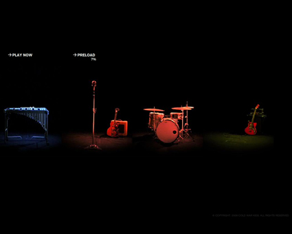
Cold War Kids "I've Seen Enough (interactive version)" dir. Sam Jones

www.mtvmusic.com (via fimoculous | more info)
Version one, dir. Vern Moen
What's the point? The music is so sparse to begin with that the ability to mute and unmute 4 tracks barely changes the dynamics of the song.
If anyone calls this "the future of music videos", i'm going to reach through my wireless connection and punch them. I still haven't seen a single "interactive" video that's interesting for more than just novelty value.
the 4 colors represent different styles/tones of music... the muting option was the least intriguing part
Not feeling the interactive video. They mix records for a reason. It'd be different if it were a layer electronic artist like Moby or something, but you're right, their music is too sparse for it to work.
The aesthetic is all wrong, too. The band has such a clearly distinct visual representation, created by their bassplayer Matt Maust who is a bitchin' photographer and designer.
I think the Vern Moen video is the best CWK video they've ever done. It sticks really tightly to Maust's style while giving it his own flourish. (Or maybe second best, after my little video I did for 'em..heheh)
