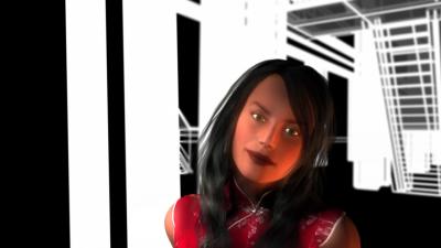
Unconscious Logic - "Are You Free?" (13-a)

We're just about to finish up this video for a track by Unconscious Logic from Brooklyn. We'd appreciate any comments. Thanks a lot.
www.gregloser.com - QT 7 35mb
Hi, for a first overall impression I would say that the whole clip feels too slow for the music. The beat is way ahead of the cutting, which makes the visuals feel very disconnected from the track. This left me picking between the two sometimes watching the visuals and sometimes listening to the track. The 3d camera moves are very linear and robotic with very abrupt, pronounced ins and outs. I know this isn’t the sort of thing that you want to hear after you have spent hours rendering but it really does have an adverse effect. The frames are quite empty which isn’t a bad thing but the lack of camera direction starts to steal the focus away from the performers because we actually have to work hard to find them in frame rather than the camera presenting them to us. I am a fan of the wireframe render look but I think there are some issue with the way you have implemented it here. At times the lines are just waaay too thick and the frame becomes overloaded with white. If you are sending that out to TV I am sure it is not broadcast safe and will bleed and vibrate like crazy. If you have a chance I suggest recomping and grading some shots such as the bridge fly over and bringing down the white point by at least 10, 20 percent and perhaps adding some texture over the top and a vignette, may even want to chuck on some flicker removal. I like the office scene the black silluhettes are very sexy, similarly the garden scene has some nice 3d design work. The opening shots are way cool I almost would have preferred that aesthetic throughout the clip, and props to the inverted blade runner spinner that sneaks through frame. Lastly I would like to say congratulations for realising a clip with real depth and scale on what I can only imagine must have been a low budget.
Looks like you've spent alot of time on the computer animation side of things which looks pretty slick technicaly. I liked the wireframing of the bridge. However, i really think the stlying, art direction of the vid needed more thought. It may seem like a small thing when your putting things togeather but working with a more refined colour palate, thinkin about the clothes the characters are wearing, casting 'personalities' all make for a more interesting viewing experience. These things can all be sorted relitively quickly at the beginning of the video making process. in comparison to the time it takes to do a CG based video it doesnt take much of your time and is crucial to how the video is percieved.
i totally agree with the two comments above.
awesome loads of ideas... so many stylez. to connect the animated stuff to the real people, work on the color of the videostuff. no need to make it pimp and slick like the animated footage, just give it a little extra so it´s something special. the wireframe is beautiful but lacks a bit in perfection in some shots, so to say.
