Fields "If You Fail We All Fail" Director: Shawn Kim

Sweet. Nice to see a polished performance video. Props to Kim & a big wave, hug and a kiss to Nick Peill who looks adorable there.
// Does anyone know what the aspect ratio was for this video? It's crazy! //
When the internet is your venue, ideas of aspect ratio go right out the window. Speaking of which, was MK12 the first to realize this...?
Ne-o's salaryman6 was another..
beautifully made, but i felt like it could have used something more to keep my attention focused.
i know - this coming from me, mr-overlong-shots.
this is a terrible and boring video. Some song's deserve band performance, but preferably with a band that can perform. The image of that guy jamming on an acoustic guitar is just ridiculous. This should have a been a trippy visual video with slight performance elements.
i love anamorphic.
uuummmmm......see coldplay 'speed of sound' by herr romanek......NICE.........this......NICE but hate song....long live harris savides
beautiful! who says you can't rock with an acoustic guitar? lotta hateorade coming from your corner, bowie. sorry your "trippy visual video with slight performance elements" treatment didn't get awarded. better luck next time...
spectacular crap.
great looking film. Who was the DP? :D
those shots of the girl - just felt off. she looks like a fembot.
sometimes being a good director is avoiding the many things that can make a band look bad or awkward. I think a lot of bands' instincts look bad on film and so it's a director's job to avoid shots or scenes where they look dumb.
Nice to a see a sweetly, cleanly shot video that uses the band's assets - looks and song.
it looks real nice and the label have probably decided its about time we had a proper look at the band
the fembot is HOT
hass you are probably right... last video here.
the fembot's got a littl'un on the way (or am i wrong?)...
think its great performance-vid, really nicely shot, a lot better than so many others that just feature the band...
The smokin hot fembot is not preggers, she's not even over weight - It's just the dress.
thanks for the sage aphorisms on directing captian. I think they look tip top, especially the fembot.
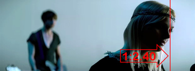
2.74:1
i love shawn's work, but this is my least favorite of his videos, but still visually better than a lot of "wall of lights" performance videos. its not easy covering a band thats in constant rotation, but it didnt feel forced in this case. i would have liked a little moodier close-ups, but when you have easy-on-the-eyes fembots in close-up its hard to avoid going a little flatter. too bad i still think it works a little better when watching in mute.
aspect ratio is 1:2.4 - shot S35mm Anamorphic.... hot band, hot video... if you don't know, you better ask somebody
dear jonniehardcore,
The aspect ratio of this video is quite clearly not the standard anamorphic aspect ratio of 1:2.40. It is, as has been pointed out by other posters, unusually wide - closer in fact to 1: 2.74.
Here's a full frame grab, annotated for your benefit

"S35mm Anamorphic" would be a most unusual combination. You are conflagrating two different techniques for creating a 'widescreen' aspect ratio. Anamorphic lenses carry a x2 horizontal squeeze which applied to a 1:1.20 anamorphic gate creates a 1:2.40 image. Alternatively one can shoot Super 35mm which has a larger mask in the camera gate and a 1:2.40 centre extraction is simply made from the full frame negative image in post.
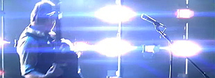
The video has quite clearly been shot with anamorphic lenses as can be seen by the characteristic flare patterns  and the vertical ellipse shape of out of focus highlights
The 'non standard' aspect ratio may be a result of shooting anamorphic with a Super35 gate and utilising additional image area at the extreme edges of the frame or they may simply have further cropped the top and bottom horizon in post. My money's on the latter.
Actually it was the former, not the latter. This is cropped for 2:35 with additional image visible on the quicktime only. This is usually cropped out on the television to give you the true 2:35 widescreen. Keeping it for the quicktime was just a style choice.
fair enough.
2.35:1 is totally for pussies.
only warner bros have the balls to go truely 2.40:1.
thats what makes the harry potter films so good.
do_geese_see_god, are you an idiot?
2.35 is the colloquial term for widescreen. It hasn't been the actual accepted aspect ratio since the 1970 SMPTE (Society of Motion Picture and Television Engineers) revision of projection standards. The projected (and correctly masked) aspect ratio of anamorphic film prints is actually 1:2.39 - which is more commonly referred to as 1:2.40.
2.35, 2.39, 2.40 - they are all one and the same.
I can only hope your comment about Harry Potter films was meant to be satirical :-S
i've always considered myself more moronic than idiotic, but thats just splitting hairs.
i appreciate your point, its just that i used to be a vt operator and warner bros used to always have a 2.40 crop on their features whereas all the other studios would work to 2.35. its just a a few lines on tape but they did technically have a different aspect ratio.
i think my last comment was beneath satire :=%
