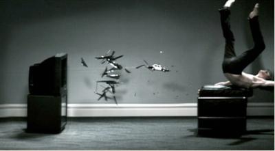
Placebo "Follow the Cops Back Home" : Dir. Daniel Askill

How much did they pay Maxell for that one? Ultimately very very boring.

(I figure if you're gonna pay homage like that, get your framing and focal length right, and watch the details -- even the baseboards are unfinished.)
i gotta disagree with you, fam. i think the framing and focal length didn't detract from the video. i found it entertaining the first time viewing it through for the sheer spectacle of it, but its kind of a one trick pony and wouldnt hold my attention for a second viewing. as the maxell reference...seems like a lot of that has been going around recently. you see diddy's recent attempt at a Maxell homage? now THAT was horrible. this feels a lot better after watching his.
Here's the Diddy vid, dir Erik White
at least this clip has a concept, slow burning like most of his work. There are a lot of slow motion videos with no concept at all.
I think Im into it. Not entirely sure. But kudos to letting Askill break the mold once again. I'm reminded a bit of that Massive attack video with the flower and the bullet by Nick Knight...liked that one more though
I think its main problem is it gives away its trick too easily. Still, very good video. Yet it keeps shouting at me: Would you like me to press play? It's like, no, I'm really not into that kinda thing.
When you cop an idea so blatantly, don't you think it's wise to make an attempt at the same level of polish present in the original?
The framing and focal length here break the tension that the original image had -- I mean, it was a huge success for a reason, right? Part of that - beyond the aforementioned visual tension - comes from the way in which the Maxell ad presented the viewer with an original concept and painstaking attention to detail.
The choice of chair, the choice of jacket. The choice of sunglasses. You can copy this; you can choose a similar chair, you can paint the picture in whatever desaturated colours-of-the-day you want, but when it comes down to it, it's just a copy.
So, if it's just a copy, you put your own spin on it. And what is more unique than a slow-motion shot of glass shards, and a skinny white guy in skinny dark jeans being tossed around? OK, that was sarcasm. How many more slow motion videos do we need that play off the same trick from start to finish?
To me, it's empty visual concepts like this that pave the way for a relatively vacuous relationship between viewer and artist. Videos that rely entirely on what kind of gimmicky in-camera or post effect someone can dream up to hold our attention do not generally do it for me.
Can we go back to our slow-mo doggies please? Heh.
I think the concept of a "slow-burner" is a pretty bad idea right now for music videos and commercials. If I've watched the video for more than 30 seconds and I'm still not sure if anything has actually happened, I'm probably not sticking around for whatever meager pay-off might occur at the end. Even the director has to find repeat viewings of this agonizing.
i found a slightly different version on YouTube that isn't just one long continuous shot, which makes it a little easier to watch. so is this the "official" version? there's also a sped-up 5-second version of this new clip if want to see the differences but can't bear to sit through another slow-motion video. ;)
(clips converted to mov 'cause i hate youtube)
I'm quite into it actually... but I was on the shoot so I may be biased.
crap song, which never helps. sheepboy's alternative version (nice one, untubed&all!) highlights what jars for me in this: the involuntarily comical elements (toy car, wild hair, plus, now, the ridiculous expression).
what happen to the Arni/Kinski version of this - i heard it was amazing but the label messed it up and then went back to shoot this
