The Sword - "Fire Lances Of The Ancient Hyperzephyrians" - Dir. Mike Colao + Josh Litwhiler
Mike Colao & Josh Litwhiler, directors Matthew Achterberg, producer Ghost Robot, production co. Steve Maing, DP Michelle Antonisse, production designer Vance Kelly & Matthew Payne, Illustrators
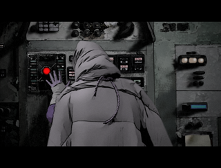
Brief courtesy of videostatic.com: Centuries of war have plunged the world into a post-apocalyptic nightmare that looks like a more surreal version of The Road Warrior. The quest in this video for modern metalheads The Sword is for booty unknown, but it's all for naught since there's a nasty doublecross in the end. Religious overtones abound — the "hero" and crew carry an ark to the final destination, while one of the main clues along the way is a sort of burning bush, but in the form of a beast with Menorah-worthy antlers. The video has a painted-on animation style, courtesy of some After Effects work done in collaboration with Blacklist and Mass Market
YOUTUBE
All and all I think this was pretty cool. My constructive feedback, not that it matter much at this point but it could help in the future, are as follows:
I think the opening could have had the same animation treatment applied to it as the rest of the video. I almost didn't watch the whole thing because I thought it was going to be another Prelinger archives video. For me there's a reference to REM "Evolution." Secondly, the skies are the weakest part of the overall look. In terms of brightness/contrast they don't match the lighting for the rest of the scene. The time-lapse thing becomes distracting too. Lastly, the footage could have benefited from a slight grain that would help to minimize that video in front of green-screen feel. But great effort, keep it up. It's got a very Mad Max / Star Wars / post Apocalypse vibe.
hmmm... I think I can fell where you wanted it to go.
Why did you use war footage in the opening? I cannot understand why. Secodnd, why did you shoot something at all? Doing it all with real comic-akira-style-animation would have looked better, I belive.
nice, real nice. love the visual style - and pretty hard to pull off, have seen a few vids try and fail like that.
would've liked a bit more time to take in the double-cross at the end... or somehow something to allow it to have more meaning? but overall, fuggin ay, good stuff!
