Get Cape. Wear Cape. Fly. "War of the Worlds" Dir. Sam Brown
 "During production we became aware of that ad. I was kind of gutted, but at the same time we all felt it sounded different enough to keep pressing ahead with it and I think the end results feel very different," said Brown.
mov here;
wmv here.
www.flynnproductions.com link is not there. :( 404.
its broken for me too.
flynn bailed at the prospect of an antville stampede... UPDATE: link fixed
this seems to be a real shame but it didnt stop michael bay and mimi leder from releasing those 2 GREAT asteroid films!!
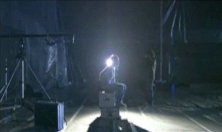
I like the idea of breaking the codes and conventions that apply to any visual medium and often in music videos or commercials this will be done with tongue in cheek. the shots of lead singer sat on a flight case, technocrane ready to fly, lightstands, frames.....all shot with real beauty........amazing studio compositions to give a feeling of lonliness. As for the exploding colours.......they look great
Cool project. As for a music video - it sucks. Horrible song too.
Take out the music and rotoscope the lead out and you've got yourself a great piece.
The effect in itself is much cooler than in the overhyped latest bravia spot. The singer seems to be a bit cut out of the effect. Too bad he's not standing in the middle of the room. Regina spektor has a video where she throws heavy colored pigments.
This is an excellent music video. The surface resemblance to Glazer's Bravia spot is nothing more than that. Taking the record company's money and using it to create an installation or an event, then using the record of that as the video (which is essentially what this video does) is done here with real integrity and panache.
i agree with prairie. its nice to see label money be used to do something physically and logistically challenging rather than just make an artist look good...although i think the artist could have looked a little better in this case. sam brown is the master of composition and linear camera movement and that comes across well here. someone should give his dolly grip a medal :-)
I almost like this one better than the Bravia ad. Yours doesn't have a douchey ass clown running around. Good job. I really love the tension you build at the beginning. You know something's going to happen just not where and when. Badical!
I prefer this to the ad definately, although I think the comparison is probably as much a timing thing then anything of importance.
I actually quite like the performance too, what there is of it.
didnt think it needed the guys setting up the rig, without them there is just the singer wondering matter of fact, into this surreal set and nonchalantly singing away while the paint goes boom. would be interested to know why the director choose this. a-morphic mentioned code breaking earlier which might explain it, mmmmm
the selection of shot is subtle and creative, and looks stunning in motion and frame by frame. great pace to the piece, beautiful work
i prefer this to the ad too - cracking video
hass - what, nary a punch in the Pellow-fight?
What am I looking at? Is the electricity arcing or Primacord igniting?

hey progosk i just tried to email you on that very subject but its bouncing back - if you mail me i will drop you a reply in the morning but i think cathy pretty much covered it in her rebuttal
Hey! CC: me on that! (info at director-file.com) I'm interested in what your opinion is as well.
hasselecta: you do need to replace the AT with an @ ... got no mail for'ye (nor has yourspace). you can aim/ichat me on progosk.
