antville awards 2006: Call for logos!
Submit your logos under this topic. If you wish to submit a logo anonymously, e-mail me (info AT director-file.com) or progosk (progosk AT tin.it), or post under an alternate username.
These will be polled, and a winner chosen. Perhaps a prize?
from raymond_dezolay, in the previous post:

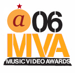
a-wards '06
d: I still don't know what to call these things..
Logos.

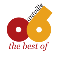
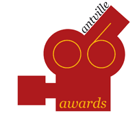
the winning entry:

omg roflmao
Cheers for that!
The Anarchist wing ov the Golden ant
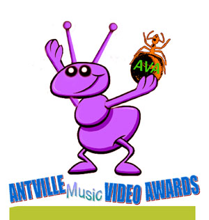
Yes, something with ants! :)
Robodrug: Your purple ant is not an insect. She (if a worker ant) needs six legs. ;)
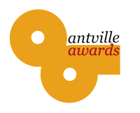
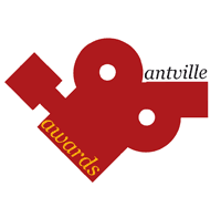
i think a lot of the 5 logo options posted by 'anonymous' are really cool but i'm afraid that they include the year (06) as too integral a part of the overall design. i think that, ideally, the logo will be able to be used year after year and will be a standard (almost an award brand) and that'll only work if the logo can stay almost entirely the same year after year.
my current fav. is raymond_dezolay's - its a clean, simple design that is future-retro - a nice touch that reminds me of the overall vibe of antville.
kalstark
I dunno, I may agree with you. This place is so goddamn ugly (and boxy) in the first place, any attempt to make it beyond what it is feels a little weird. But ?? I have no idea, I'd love to hear what other people think about logo ideas. My design style (if there ever was one) is very texty, so maybe I'll give one a shot. I'm not feeling very well though this afternoon..
Robodrug: Ant's cute and nicely drawn. Drop the award and the words, in my opinion.
my 2 pfennig: a good logo for th'awards should:
- reflect antville's specific web i.d. (i for one love all this whitespace) at least in part
- signal some of the 'tude antville is prone to
- be built to last (w/ variation)
i find photoshopper's entry in a league of its own: it's unbeatable for the awards ceremony gala invitation!
Exactly. Deserves poster-ization.
prog> surely this fulfills your criteria:
[sorry, should really be in the proper font...]
r_o_o: minimal gets my goat, but: where's the 'tude? (plus it would actually be a tad misleading, since that's not possible as a real link...) but that's just me - you shall be polled!
Wait a couple more days. Better logos to come me thinks... -j
'Photoshopper' has got my vote. Perfectly irreverent. Imagine this on the header of press releases!!!
Here's my go: Extremely basic in conception with a font that I feel reflects a little bit of attitude and the technological basis of the music video medium in itself... or something.

like it a lot, derek! (lower-case version of that font would have been even supremer, but this is already great as is, methinks.)
c'mon designer-lot: last call for logos! got to get these polled pdq!
