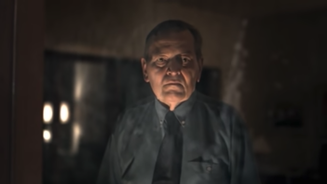
Fever Ray - When I Grow Up (Dir: Martin De Thurah)

Really liked this, simple, beautiful amazing photography, at first i thought the styling may be a bit much but in the end i think its works.
Beautiful! Love the intent of taking a single moment and squeezing it on all its cinematic juices/potential.. subtext is almost cliché De Thurian, but actually comes from within the song and works really great!
This is great. Really enjoyed watching this. Nice week for antville.
just: powerful. (amiwrong or is that the young lady from "human" allgrownup? oh, and: love the leftfieldian sound of the track - it's what fits so well in this.)
More brilliance by De Thurah. His skill astounds.
K
Did he direct the first video too? That one was some kind of awesome. -j
Edna! That crazy lady is on the diving board again!
no, andreas nilsson did. this one's not bad, but there's no topping that one.
gooood. especially the shot of the man in the window.
i can't decide which fever ray video i like better.
I really like the concept for this video. I wish the song was a bit better.
it is she:
 when i grow up, indeed.
Wow. That's easily the coolest diving board music video I've ever seen. Trippy. Reminded me of an MTV version of "The Ring".
Good eye Progosk. ;)
K
Big Miss for me. The hi end female shaman shot in a wilting grey backyard swimming pool just did not impact on me at all. Nilssons clip of similar slow mysterious tones was way better, it had weight to it. This one came off as someone who understands good photography but is a bit behind the times in terms of what is or what was hip. Aside from some art direction/ aesthetic and relying on what has come before for Fever Ray there is nothing here conceptually or narrative wise and hence the clip just felt thin to me. I started to hope the creature from the Abyss would come out of the pool and save this video.
or Lady in the water
Didn't do it for me either. Nicely shot as usual with de thurah but as 'wing' says above the concept and narrative is lacking. I also found the art direction a little laughable. Like someone trying to continue what Nilsson started with the first video but just not getting it.
I guess not a bad video but left me somewhat disappointed especially after Nilsson's brilliant video.
Jump in the fucking pool already!!!!!
How come more videos don't have people with plastic utensils tied to them? Oh wait, I know, because it's totally fucking retarded. She looks like she escaped from a Ray Tintori video.
I like DeThurah, but this one is a total reach.
"She looks like she escaped from a Ray Tintori video."
hehe. funny.
I really liked this. Really shows how to take a simple setup and make it work for an entire video. certainly got the mood right.
but, Stoney, really, was it that funny?
really, really. touché.
yup, well tasty. really nice sense of foreboding.
lovely. as stoney says, the mood and pace are perfect and that maketh a great video in my book
... the old mood and atmosphere vs narrative and concept argument.
well not this time. this time not even the mood & atmosphere are what they used to be. im glad i was the 1st to throw the stone into the well.
love it! - imho better than the vids he did for "Glasvegas" and "Will Young" videos.antville.org videos.antville.org .
I'm confused. I really don't see what is good about this video besides the cinematography. I don't really like his "Glasvegas" video either but its leagues ahead of this one.
what de thura does which almost no other current music video director can claim is: all his shots are strong, wether its a hand, or a wide shot, or water bubbling. he is able to make everything poetic. its not because of the DP, this treatment in the hands of almost any other director would totally suck. I'll agree his videos lack narrative but I think he does his thing so well, you cant hate on him.
@shut up: I dont hate de thurahs work. Infact i quite like some of his other videos. I agree his direction of each shot is perfect but these shots add up to nothing.
You say that this treatment would have sucked in the hands of almost any other director is the reason this video does nothing for me. No matter how you dress it up the idea sucks.
hmmm. cinematography ...lack narrative.
For me there is enough narrative in this Clip. A girl, dressed in some weird clothes. You can interprete so much in it. (sorry for my bad english). Ist a "youth thing". I once was a punk, today teh kids are dressed as emo's or whatever. And the "kid" in this video is doing "something big" and the adults (parents) just standing on the side... watching... don't understand all the things.
I like the "voodoo" thing.
As I saig before.. I don't like the "Glasvegas" vid and the "Will Young" Vid. The "Will Young" Clips starts great. The Cow, the Woman, the air. And than "Will" is ins some old house, sitting on a bad... some smoke... some dancing on some fire. And at the end some rain. I just don't get it. I can't interprete anything in it. Or I can interprete everything. Its the same. Nice cinematography... but thats it. (for me)
Same with "Glasvegas". I know... the storm and the particles and the lights. it's okay. Better than the "Will Young" Clip.
And now "Fever Ray - When I Grow Up". And I love this Clip. For me it has enough narrative and looks good.
Omg - you guys are so stuck on yourselves that you can rarely appreciate something for what it is. As we say here in the South, it is what it is. When you visit an art museum, who gave you your PHD on citicism? Exactly. No-one ever earns one. Enjoy something for once in your miserable lives that is exactly how the artist made it at the time. Just as any painting you might view in your favorite museum. I can't believe I still have to educate people on the premordial facts.
You realize it's been six years since this happened. Things have changed quite a lot since.
..and the video has become more meaningful, while these comments are a smidge out of touch.
Unlike myself, who has since been crowned King of the Internet.
