antville Music Video Awards 2006
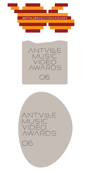
Logo Poll !time to choose from the entries. (this poll will remain open til sunday. call for video nominations coming next week...)
NB: i find photoshopper's in a league of its own, and would propose to use it as a cover image where-/whenever necessary and possible.
thus, without further ado:
Might we run into certain copyright problems if we issue press releases with the MTV-tampered logo (#1)? This is worth discussion: I don't think being on MTV legal's radar is good for Antville.
shurely you jest...? (apart from the fact that that's about the best thing that could happen - can you imagine robodrug's reply to an MTV cease and desist?!)
k means this
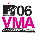
what, do you seriously think 1. they own that type? 2. they own the wording? but above all 3. they give a flying doohickie?
While it would make great press, and the possibility of a successful lawsuit is incredibly small (and monumentally retarded), I thought it was worth a note. If Shots created an MTV-tampered logo, how would MTV react?
Where did you get that logo, anyway?
from momma google, natch'.
More nagging nanny: Where are we sending the robodrugged press release?
Purple ant needs a pair of extra legs. :P
What happens next year to all the film camera/film can logos containing 06? Do you redo a logo every year? This will effect my vote.
My point is: Logos/images are very important to a news story, especially online. Having a potentially unpublishable logo may hurt the Antville Awards' efficacy.
You've made it clear to me, though, why there aren't many female commenters here. I'm dropping the subject after this comment, but look forward to your, or anyone's, reply.
any antville comuniqués will have the half-life of a gnat - there's not even going to be time to get sued. (honestly, i think you're getting your knickers in a bit of a twist here.)
about the press release: i was pretty sure you'd know exactly who to dial up. hey, we could just send a stash to cathy.
regarding further graphics, here are a few more nice pix i stumbled across, which might lend themselves to something:
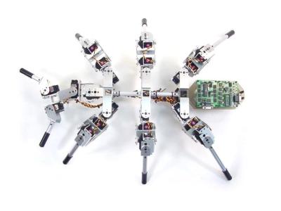


even a cheesy little consolation prize
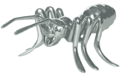
as well as the coveted grand trophy (un-gilt)
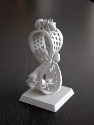
ps: what this has to do with sexual politics nonplusses me...
I think that this poll suffers from the same problem as the categories poll. i.e. it uses a 'first past the post' voting system.
This means that any category crossover severely effects the results and that the anomolies of a small number of voters choosing only one category are disproportianately magnified.
Surely a better and far more subtle system would be for voters to rate a number of entries - (anything between none and all of them) with a value between -5 and +5. Any categories not voted for default to a neutral zero of course.
It's too late for this poll, but perhaps it's worth considering for the main event.
The only slight downside to this system is that an overall winner could be the one that everybody sort of likes, rather than the one that half adore and half hate.... although I find this an unlikely scenario.
As I think you mentioned before, progosk: voting in the comments section not only minimises the risk of people making multiple votes, but also simplifies the otherwise complex structure of the poll.
For the MTV adaptation, I think the question is whether the visual identity should be irreverent, underground, copyright busting etc. or proper, clean, take-us-seriously, above-board.
The more I think about it, the more I think the former.
In fact, the more I think about it, the more I think we should abandon the corporate idea of a logo and use Photoshopper's montage as the sole visual identity.
Before we all become mildly autistic (too late):
Let's just go with the 1st logo and stop wasting everyone's time (including our own).
dearie me...
let's please not kid ourselves how seriously this place, (and by the same token, these awards) should be taken.
ben, re. polls vs votes-in-comments: polls-in-main-post generally get about 100 voters if they're simple, about 50 if they're complex. the categories poll-in-comments had 30 voters. i'm really curious to see how many (of the 3500 daily visitors) will be bothered to nominate in comments... the gradient vote you suggest would undoubtedly allow a subtler expression of the antville mind - it would however also require such presence of mind (i believe) to put off a substantial slice of the electorate from voting at all. so at every turn we're necessarily looking at compromises, both methodological and qualitative. but, at the end of the day, is it really worth such (admirable!) concern? isn't this all a bit of a lark, fundamentally?
re. logos: i'd love to have gone with nekkid gondry, (anti-logo, so to speak) - but it's just too damn huge to be useful as an id marker. (just as disclosure: my vote did not go to my own thrown-together attempt.)
can someone please step in and pass round a spliff?
This post basically encompasses everything that I love about Antville. Can we please just go with the first logo?
err...lads why not jus' vote No one eva listens to the hustings anyway!
Also there seems to have been more votes cast for my effert that the one I voted for Thats nice, it's more popular than I thought, shouda been sprayed yellow though!
poll now closed - here's what's been decided by 120 'villers:
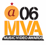
now: if someone could volunteer to do a colour-corrected/larger version of this...
i totally missed the train for the logo contest, but i was told i should post these on here anyway!
the grey notions capitalize on the "ant" theme.
