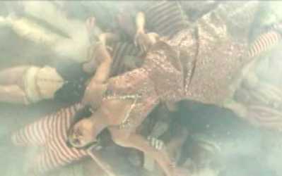
Fiona Apple - O' Sailor (Dir. Floria Sigismondi)

Choreography and costuming kinda reminds me of 80's Corbijn & Fincher.
disappointing on several counts. basically plays the same chord of her malaise that romanek imprinted so unforgettably (her looks into camera feel like they're still from back then, only this time she's presumably just seasick). setting everything in a maritime equivalent of jonze's hotel, and then dragging it out lackadaisically makes for a pretty dreary show.
I think its perfect for the song, and beautiful.
I find this one boring. The visual cliches do little for me, on an emotional level, and the attempts to inject some kind of story get totally lost (as in: why bother, if you're not going to take it anywhere?). The ballroom scene is nice. Overall, to me, it recalls Ridley Scott's Legend as far as the visual style goes (think of the unicorn scene). The faux rain/sea spray kept destroying my suspension of disbelief.
Ain, not bad. Better than her interpol video anyway. Geez, I wonder if Floria will ever top that Sigur Ros video she did way back when? -j
Hmm... don't know about the video, but I like the song (though it does drag until the better bit at the end).
Her new album's great too.
It may not be the most conceptually original video, but Sigismondi's originality lies at a visual level - the painter / photographer's eye is at work here. The wide shot of the tall room with the caustics and dolphin silhoettes dancing on the wall is quite beautiful.
But what I really like about this video is that despite all its visual flamboyance, it remains understated and eerily captivating.
Benroll: I agree that some of the shots are pretty, but I have a hard time agreeing that the visual concepts are particularly original. The entire motif behind this video has - to me - traditional, and conventional underpinnings (sailors and debutantes, etc.); the feel of it being a staged play, the use of the cast to accentuate this feeling, and the juxtaposition of the cinematic framing are also tried and true. I'll reference Ridley Scott again, and Gilliam and Jeunet, but particularly Baz Luhrmann.
Understated in it's direction yes, but clearly flaunting the budget in it's visual excess.
(Your videos for Warmsely and Drinkme were excellent, by the way :)
Familiar: It's funny. I agree with you about everything, but I still like it.
Floria Sigismondi has built a distict visual oeuvre, although I concede she may not go down in history as one of the great innovators.
Too right about the production budget - you can virtually taste it. Lavish art direction is a bit of a guilty pleasure - probably since I'm usually deprived an art dept budget myself.
It shouldn't be my cup of tea, but there's something about it that really grabbed me. Not sure if it's the charged emptiness of the spaces, the understated performance or simply the music - it's certainly the bits in between the bigger picture. Maybe I'm just having a funny turn. But I do like it.
Cheers about the vids btw. Just checked your site...flattered indeed by the mention! Adam Bartley's Tom Vek is already a favourite (incidentally, photographed by Stein Stie as were Drinkme & Jeremy Warmsley)and I love the Man Man one - which was new on me.
wasn't crazy about it when i saw it on vh1 a few weeks back. the only part i really liked was her in the chandalier. but i'm not crazy about the song either so maybe that's part of it. there are much better songs on the cd than this, so i don't know why they chose it.
I really love this video. I think it's extremely visionary and pure eye candy. I love the feel of Fiona walking around as a ghost aboard the Queen Mary. One of her best videos.
Sigismondi is the last great purveyor of the 80s MV.
